
PROJECT OVERVIEW
Role: Sole UI/UX Designer
Tools: Adobe XD, Adobe Indesign, Optimal Workshop, Usability Hub, Apple iPad and Pencil, Sticky Notes
Duration: June 2020 – September 2020
Description
HomeAdvice is an application that provides users with the ability to instantly connect with experts through chat, call, or video to get advice on home projects. This app is designed for homeowners of all different experiences who are seeking assistance and support in their home improvement DIY endeavors
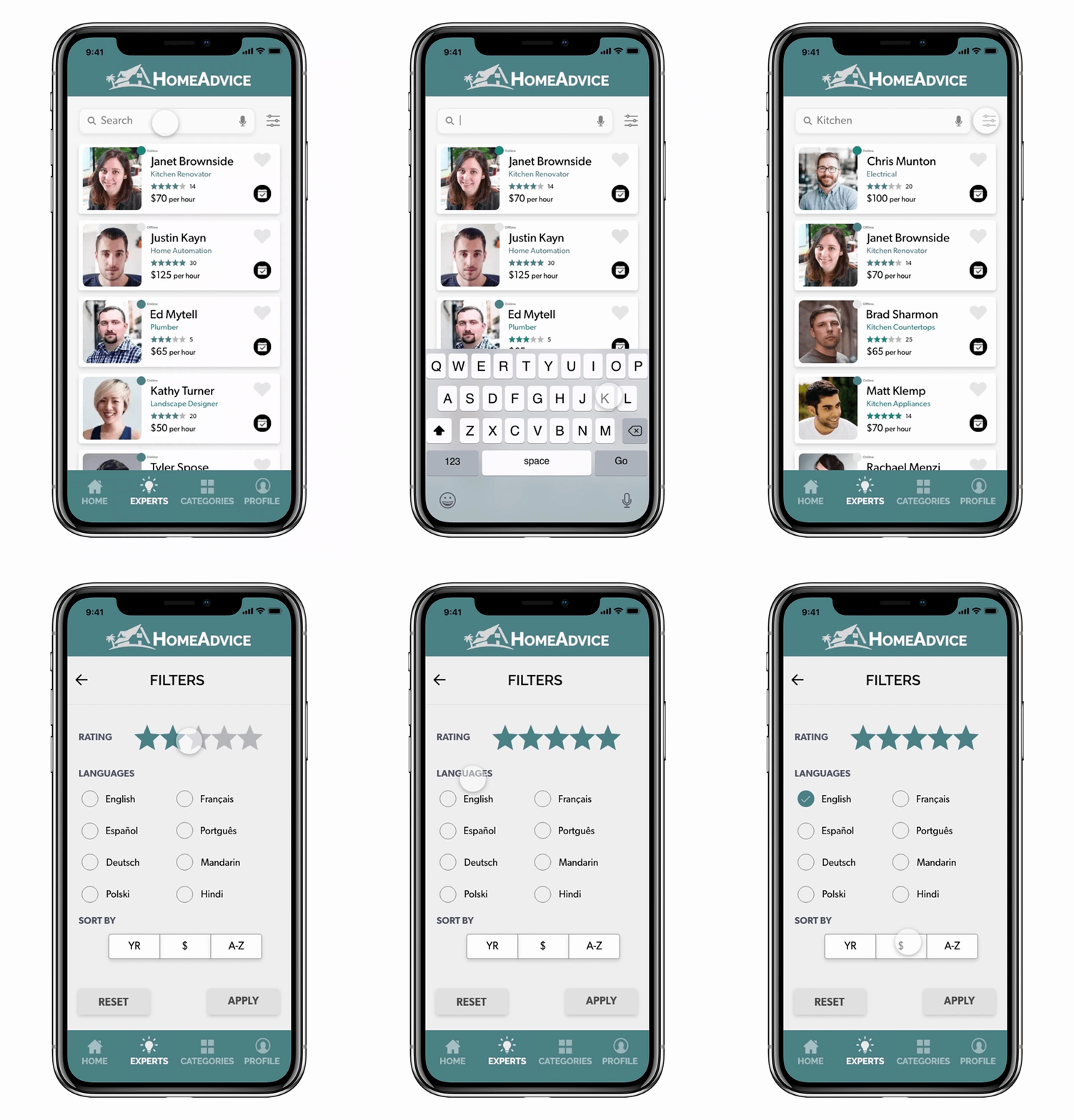
Search for experts with access to their background, focus areas, qualifications, and experiences
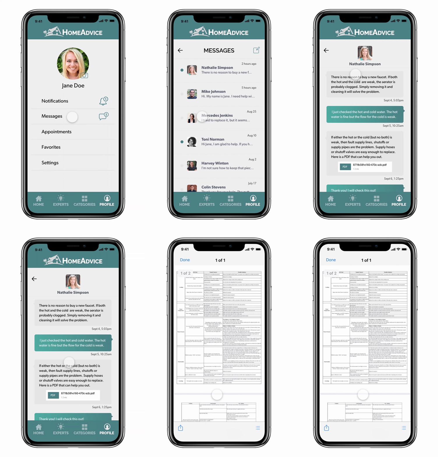
Receive detailed information from an expert with one-on-one assistance and supplemental materials that can be viewed at anytime
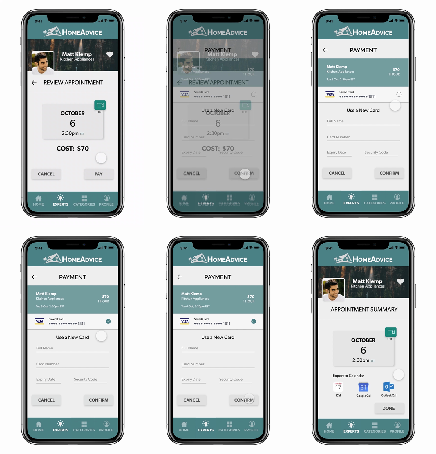
View cost upfront and pay using various methods seamlessly within the app
The Problem
Individuals who are undertaking home improvement projects on their own or in other words DIYing spend hours and endure much frustration trying to find advice for their project. They find themselves having 20 tabs open trying to swift through information and connect it together to help them with their specific problem. In addition, they have to deal with the lack of assurance of whether the source is experienced and reliable, will respond within a certain timeframe, or even understand what their problem is. Then there is the issue of secure payment and information security.
The Solution
HomeAdvice will take away the frustration and confusion of finding advice for home projects by offering an app that is simple, yet provides a great deal of information without overload. HomeAdvice will connect users with certified experts in an interface that will allow the user to explain their specific situation and receive tailored advice. Through the features of intuitive search, seamless booking, solid security, and highly functioning interfaces, HomeAdvice will solve and create a satisfying, uncomplicated experience for users.
METHODOLOGY
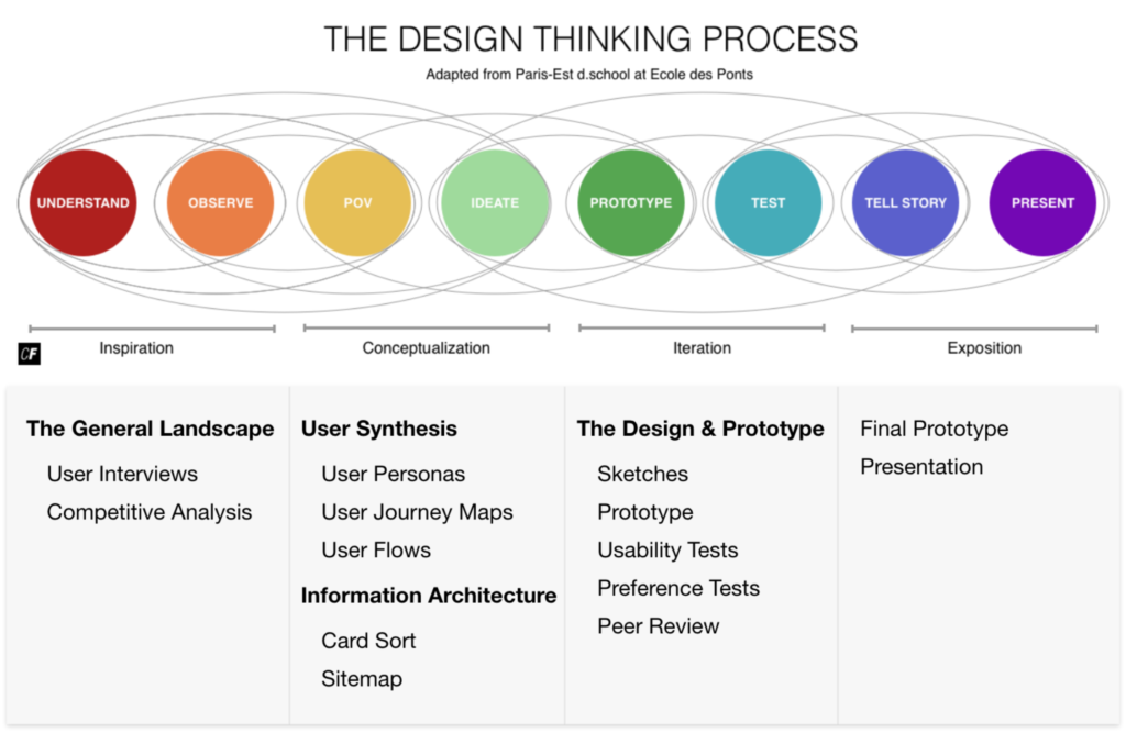
THE GENERAL LANDSCAPE
RESEARCH
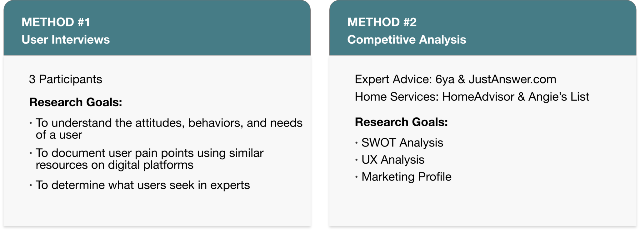
I wanted to get a clear picture of how individuals went about seeking advice for home improvement projects. Here are some research techniques I used in order to get a better understanding of their behaviors, motivations, and pain points.

USER INTERVIEW AFFINITY MAP
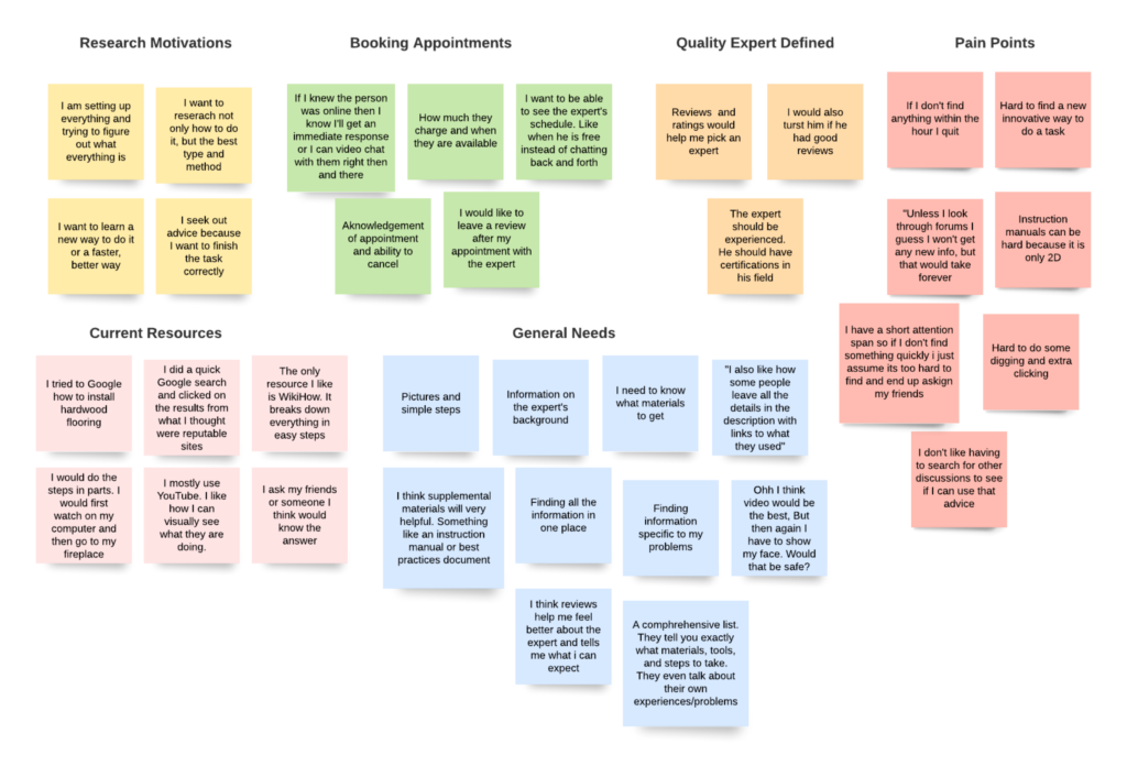
USER SYNTHESIS
User Personas
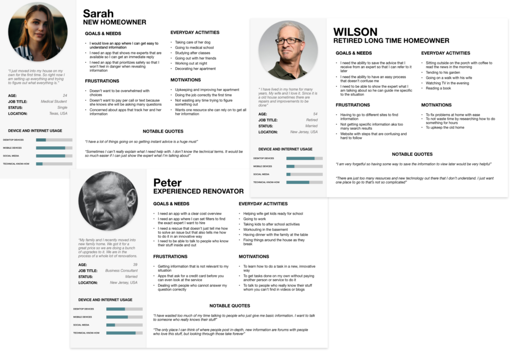
In order to follow a user-centered design process, I created user personas in order to empathize with the different types of users. These personas are based on the research conducted. These user personas serve as a starting point to reflect on the needs, behaviors, and challenges of the user and possible solutions that can be considered later throughout the design process.
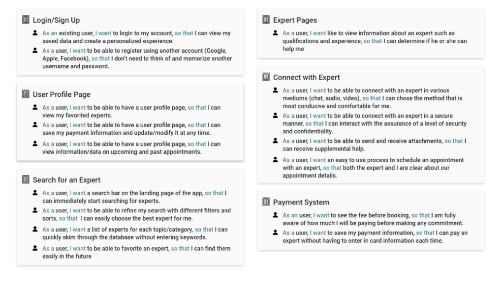
User Stories
Below are high-level product requirements broken down into granular user stories.
User Journey Maps
After identifying scenarios that each persona would come across, user journey maps were constructed to better understand how users will use the app to complete a specific goal. Each scenario was broken to represent the user’s thought and emotional experiences. Each step uncovered useful insights that helped to determine which features will be useful for the app.
User Flows
I continued on to the task analysis process to determine what tasks are required to complete a goal in the contest of the personas I created. This involved creating task flows and then adding context and visual aspects in the form of user flows.
INFORMATION ARCHITECTURE
Initial Sitemap
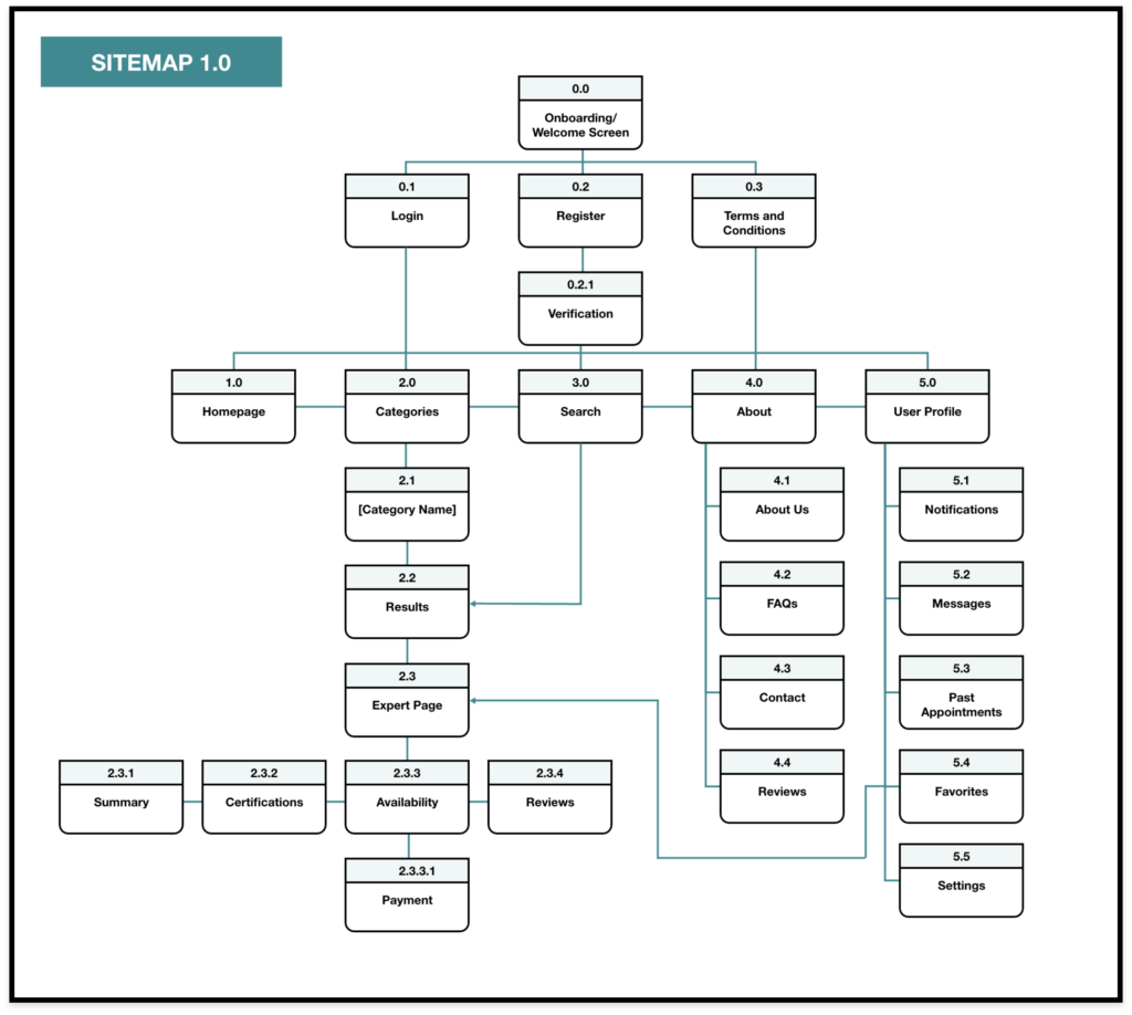
Using the user journey maps and personas I created, I set out to create the structure of the app, in particular its hierarchy. I started to plan out the primary and secondary screens and put together a sitemap. I decided the best fit for my app was a strict hierarchy layout structure.
Card Sort
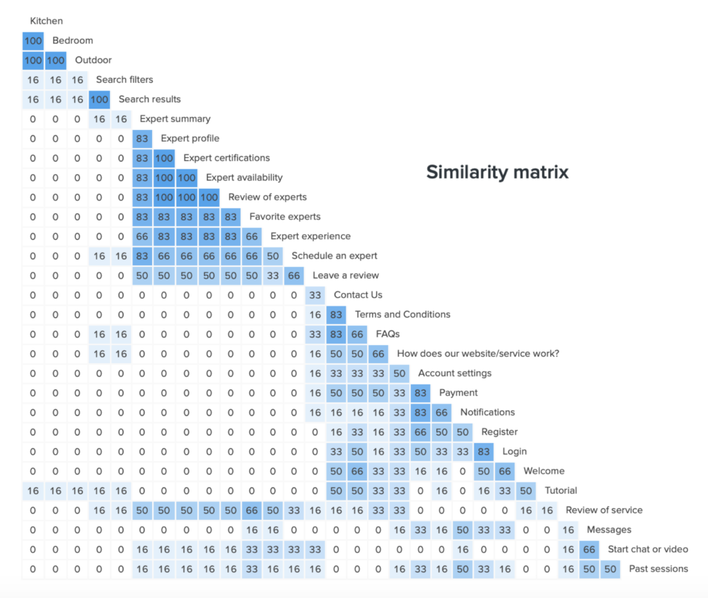
I have created a solid plan for the organization of the information of my application, but I must make sure that my plan is intuitive in the eyes of the user. To ensure this I used a participatory design method, card sorting, to provide me with insights on how to create the most logical and user-friendly way to organize my application. I utilized OptimalSort to conduct my open card sort. Below are the results of the card sort.
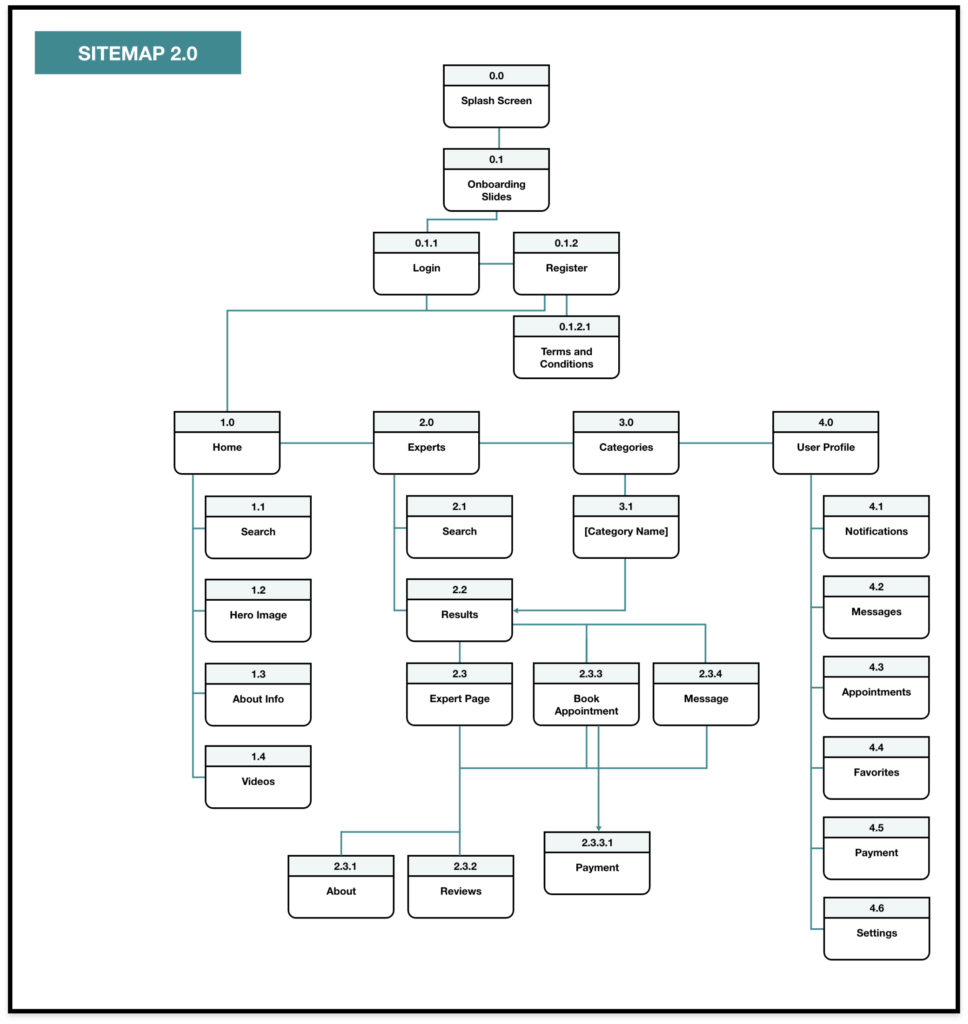
Refined Sitemap
Based on the results of the open card sort I made the following changes:
• Create separate pages for Experts and Categories
• Take out FAQs and “How Does Our Website Work?”
• Add more to Homepage – Articles, About Info, Tutorial
• Include Search into Experts and Categories
• Consolidate Summary and Certifications into About under Expert Pages
THE DESIGN & PROTOTYPE
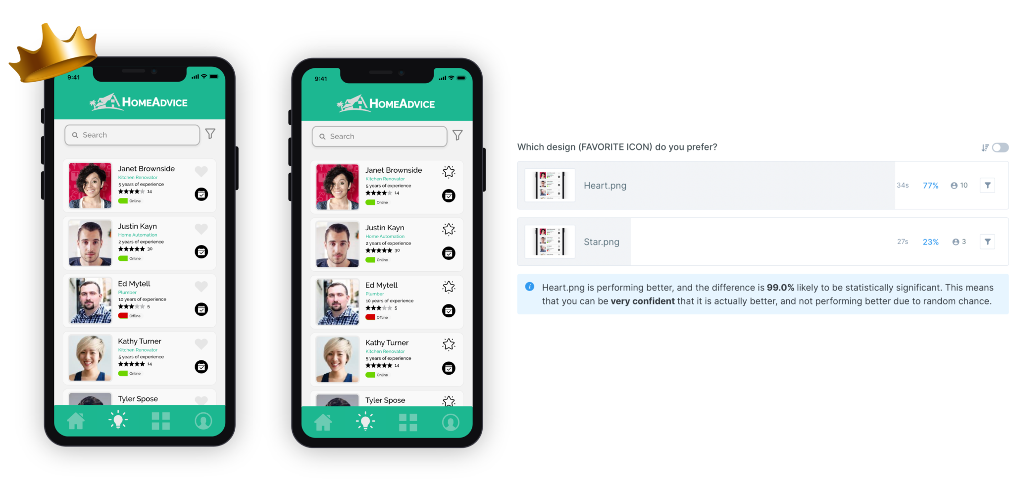
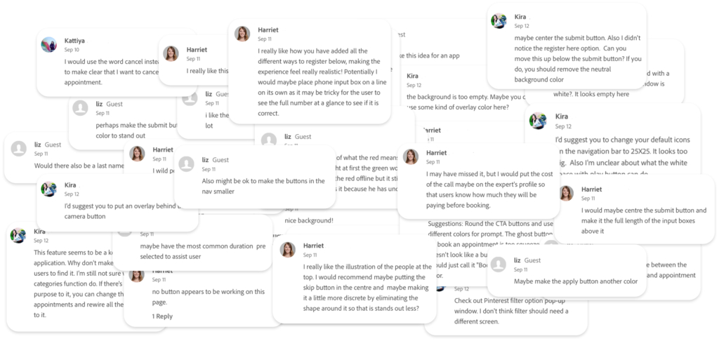
Through this iterative design process, I utilized various frameworks which helped me keep the user at the center of the design and development process. For example, I incorporated the principles of usability heuristics, visual and emotional design, responsive frameworks, and accessibility. In addition, I conducted a Usability Test, A/B Preference Test, and Peer Review to test and validate my design decisions.
Usability Test
Rainbow Spreadsheet
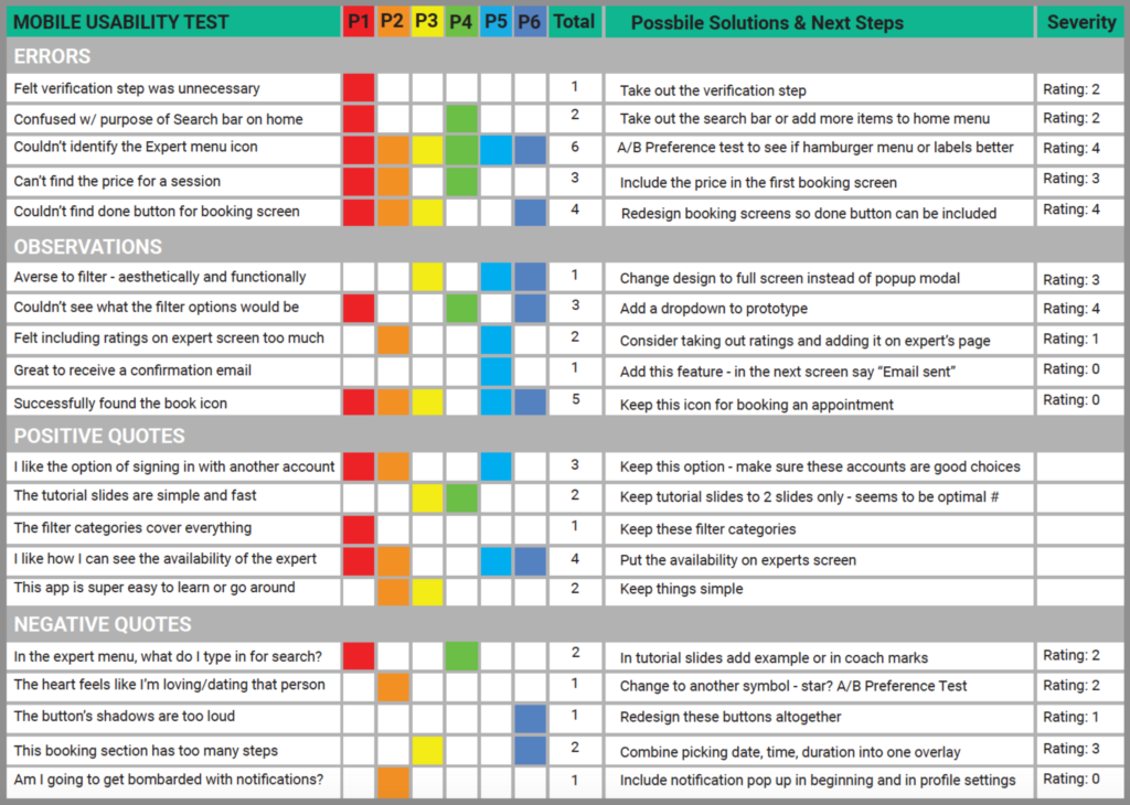
A summary of this rainbow spreadsheet was included in a usability test report as a list of issues. Below are some of those issues and the proposed changes.
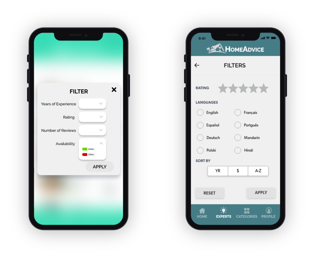
- Transitioned from a pop-up modal to a full screen layout
- Took out dropdown buttons and made all choices visible
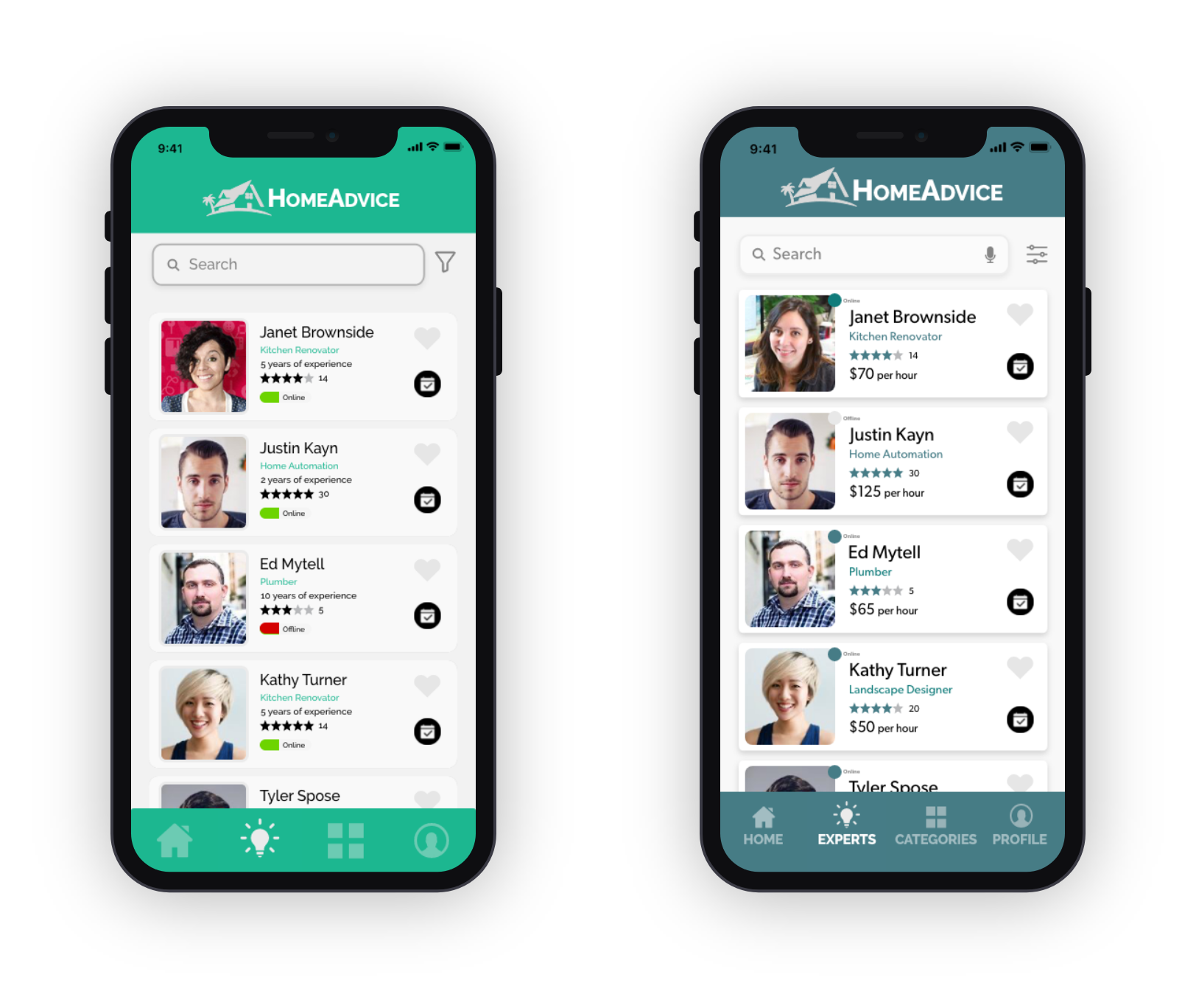
- Increased shadow to make card more prominent
- Added price per hour onto Results page
- Changed the design of the availability status
I’m clickable!
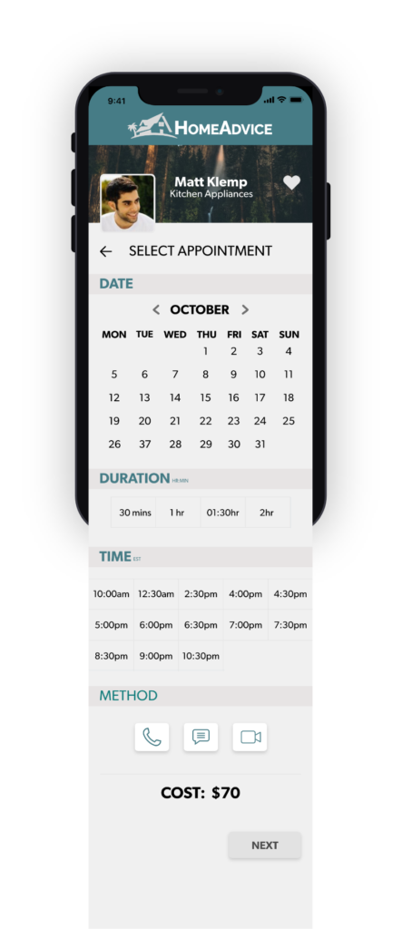
- Booking process all on one page
- Option to select type of appointment:
Call, Message, Video
A/B Preference Test
Peer Review
Fidelities
Below is a showcase of the progression from sketches to low, mid, high-fidelity wireframes to the final screens.